Salt Floral
Logo
~
Typography
~
Photo Manipulation / Editing
~
Pricing Menu
~
Logo ~ Typography ~ Photo Manipulation / Editing ~ Pricing Menu ~
Logo
The job of a florist is to create a memorable experience between nature and people, so I designed this logo to show that relationship; two hands coming from different ways, bound by a plant, connected by a portal to nature.
Style-wise, I created a lino-block print inspired mark. I tried to replicate the cuts by creating slivers of negative space. I also added a paper-like texture to the logo to support the block print style.
Overview:
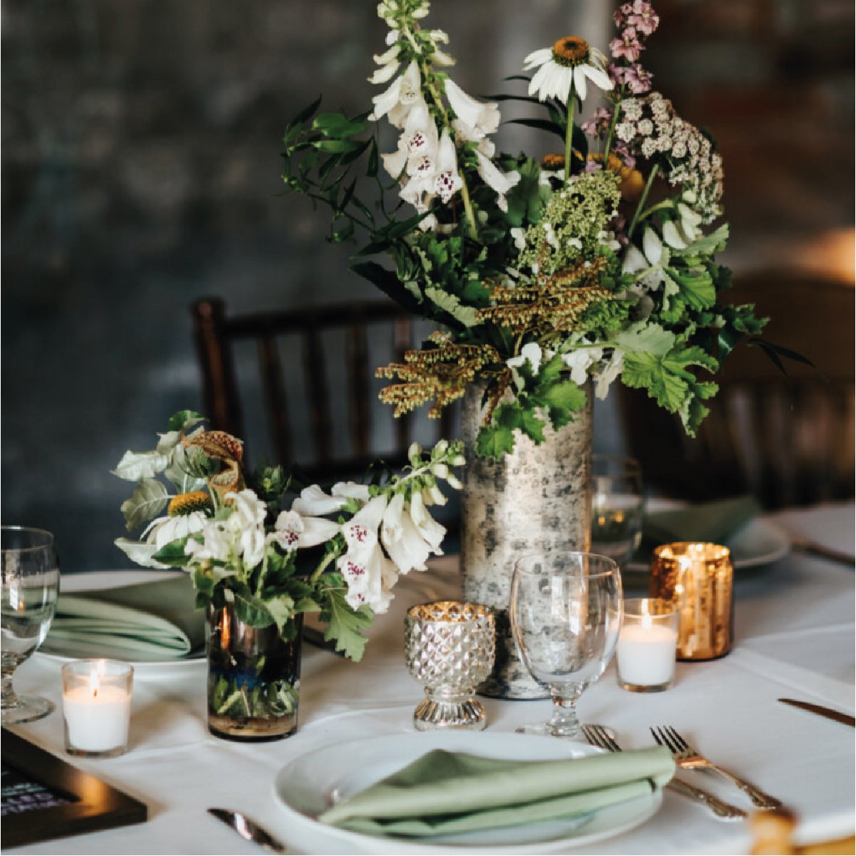
A flower grower and floral design studio out of Philadelphia, supplying responsibly grown, specialty cut flowers to decorate day-to-day lives and specialty events. I was tasked with creating their logo and branding, basing it off of their high quality botanicals and using it as a way to personify their mission and their appreciation of nature.


